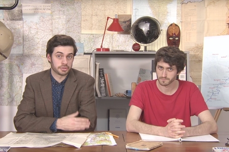

Mark Cooper-Jones and Jay Foreman, the Map Men, tap into a rich vein of geographical quirks to teach through comedy
Via Mike Busarello's Digital Storybooks
Get Started for FREE
Sign up with Facebook Sign up with X
I don't have a Facebook or a X account


 Your new post is loading...
 Your new post is loading...
Your new post is loading...
Mark Cooper-Jones and Jay Foreman, the Map Men, tap into a rich vein of geographical quirks to teach through comedy Via Mike Busarello's Digital Storybooks 

Jeremy Hansen's curator insight,
August 29, 2016 12:43 PM
Holy heck these guys are good! I'd like to see more of these Map Men videos. I'm sure at least some of my 8th graders can appreciate some British wit.

Colleen Blankenship's curator insight,
January 22, 2018 1:21 PM
Funny and full of information!

Laurie Ruggiero's curator insight,
May 29, 2018 5:29 PM
Unit 1
Sign up to comment

How to tell two radically different stories with the same dataset.

Jose Sepulveda's curator insight,
July 29, 2016 1:19 PM
thee precaution should be taken with environmental data published as integrated variable maps
Colleen Blankenship's curator insight,
August 4, 2016 9:12 AM
Maps, like statistics, can tell very different stories using the same information! Read this for some examples!

"As you may know, Google Maps uses the Mercator projection. So do other Web mapping services, such as Bing Maps and MapQuest. Over the years I’ve encountered antipathy toward the use of the Web Mercator from map projection people. I know of two distinct schools of opposition. One school, consisting of cartographic folks and map aficionados, thinks the Mercator projection is 'bad': The projection misrepresents relative sizes across the globe and cannot even show the poles, they are so inflated. The other school, consisting of geodesy folks, thinks mapping services have corrupted the Mercator projection, whether by using the wrong formulæ for it or by using the wrong coordinate system for it."
"Watch along with Expedition 38 crew members Mike Hopkins and Rick Mastracchio as they look at various cities across the globe from the vantage point of the cupola on board the International Space Station." Tags: mapping, perspective, images, remote sensing, geospatial, unit 1 Geoprinciples.
|
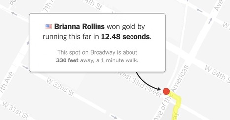
"What would Olympic races look like if they took place near you? Enter your address below to find out, or keep clicking the green button to explore races that begin in where you live."
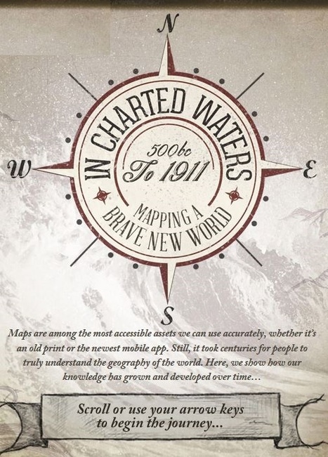
Use our interactive In Charted Waters tool which shows information & visuals on how our knowledge of the world map has evolved. Via Michael Miller, Mike Busarello's Digital Storybooks

Robert Slone's curator insight,
February 25, 2015 7:23 AM
This interactive map is phenomenal teaching tool that would be great for teaching elementary school children introductory geography, 
Samuel Meyer's curator insight,
March 23, 2015 12:00 PM
It is notable that the world's map has changed much since the advent of cartography, and many believed that the Americas were part of Asia. This is represented in the map.

Alex Smiga's curator insight,
September 7, 2015 4:29 PM
Seth Dixon's insight:
This video covers various topics important to mapping and satellite imagery (and alesson from an APHG teacher on how to use this video with other resources). There is so much more to the world and space than what we can see see. Chromoscope, referenced in the video, simulates other forms of energy on the electromagnetic spectrum besides just visible light. This type of information is at the core of the science behind all of our satellite imagery. This video also covers many map projection issues and highlights online resources to understand map distortion including: Google’s Mercator Map PuzzleJason Davies’ interactive map projection websiteInteractive Gnomonic Projectionand the military's live rendering of what the Earth looks like right now. |