


"Simulating climate conditions over the last 125,000 years and predicting how those changes would have allowed humans to spread around the globe, this video models human migration patterns." Read more: http://ow.ly/lWIp304qZEo
Via CT Blake
Get Started for FREE
Sign up with Facebook Sign up with X
I don't have a Facebook or a X account


 Your new post is loading...
 Your new post is loading...
Your new post is loading...
"Simulating climate conditions over the last 125,000 years and predicting how those changes would have allowed humans to spread around the globe, this video models human migration patterns." Read more: http://ow.ly/lWIp304qZEo Via CT Blake 
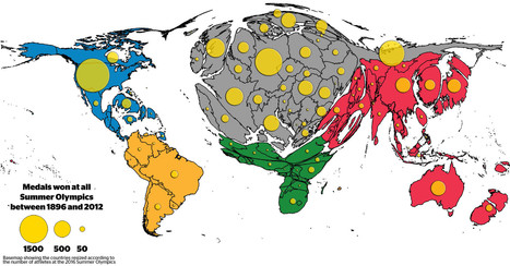
The distribution of medals shows the existing Olympic inequalities: The overall patterns are a reflection of wealth distribution in the world, raising the question whether money can buy sporting success. Besides investment in sports by those countries who can afford it, the medal tables also reflect a battle for global supremacy in political terms.
Tags: sport, popular culture, mapping, historical, cartography. Via GTANSW & ACT

PIRatE Lab's curator insight,
August 15, 2016 8:32 PM
Another very interesting way to present geographic data.
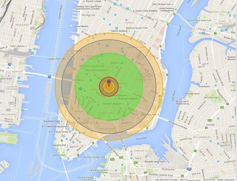
"Maps bring the horror of Hiroshima home -- literally. Alex Wellerstein, a nuclear historian at the Stevens Institute of Technology, created a NukeMap that allows you to visualize what the Hiroshima and Nagasaki explosions would look like in your hometown. Kuang Keng Kuek Ser at Public Radio International has also developed a version, using slightly different estimates. Here is what Little Boy, the Hiroshima bomb, would look like on Wellerstein's map if detonated in New York City." Via Mike Busarello's Digital Storybooks

Kristen McDaniel's curator insight,
August 7, 2015 11:12 AM
The NukeMap allows you to set different determinations such as bomb size, etc, as well. 
Chris Costa's curator insight,
November 25, 2015 11:48 AM
I highly suggest tinkering around with "NukeMap," as I have spent the last 30 minutes seeing how different bombs would destroy my neighborhood and the surrounding areas- it will even adjust for varying casualty rates in areas with higher or lower populations, even just by moving the detonation site a couple of streets away. It's pretty cool at the surface, but to examine the destructive capabilities of some of these weapons is downright terrifying. You view the blast radius encompassing your home, your entire existence, on a computer screen, and its easy to forget the devastation of it all disappearing. For those who survived the atomic bombs dropped at Hiroshima and Nagasaki, there was no simulation to tinker with, but instead a reality more terrible than anything I've ever had to endure in my own personal life. Thousands of lives lost, thousands more left irreversibly shattered, never to be the same again. All because men in government buildings on opposite sides of the ocean couldn't get along. No one wins in war.
World Religions Christianity Islam Judaism Hinduism Sikhism Budhism Spread of Religions by time from 3000 BC to 2000 AD. Discover the origin of religions Per... Via Suvi Salo

Elle Reagan's curator insight,
March 22, 2015 3:17 PM
This was a nice video of good length that allowed me to see how the world is broke up into different regions. I know that religion is a main factor of how places are divided and so I thought this video was a nice visualization of that. The map with the timeline was nice to have and I liked how it gave us an estimate of how many people are following each religion today. The video also helped me see how religion can be a main factor in defining world regions. 
Jacqueline Garcia pd1's curator insight,
March 22, 2015 3:26 PM
In this video we are able to see the growth and fall of religions. It was quite fascinating to see the number of people in each religion and where in the world the spread. I thought it was helpful to see the dates of events that either caused spread or destruction of religions . For example the birth of Muhammad and the Crusades. THis shows the spatial distribution of religion. 
Ryan Tibari's curator insight,
May 27, 2015 9:58 AM
This video puts world religions in a more basic form. Shows the patterns that religions take on a global scale, outlining the most prominent and least prominent throughout the world.
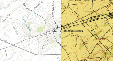
"This cool new historic mapping app from the folks at esri and the U.S. Geological Survey is worth exploring. What it does is take 100 years of USGS maps and lets you overlay them for just about any location in the nation. That allows users to see how a city – say Harrisburg – developed between 1895 and today. The library behind the project includes more than 178,000 maps dating from 1884 to 2006."
PIRatE Lab's curator insight,
August 13, 2014 12:25 PM
For more ESRI maps that let you explore urban environmental change, the 'spyglass' feature gives these gorgeous vintage maps a modern facelift (but not available for as many places). The cities that are in this set of interactive maps are: Chicago (1868)Denver (1879) Los Angeles (1880)Washington D.C.(1851)New York City (1836)San Francisco (1859)

America's war for indpendence began on April 19, 1775, when the first shots were fired at Lexington and Concord in Massachusetts. Tags: USA, historical, mapping, National Geographic.
|

One specialized unit gathered data that could guide a missile to a target thousands of miles away.
The work of the 1370th bridged a crucial gap in the history of military technology. By the late 1950s, both the United States and the Soviet Union had developed intercontinental ballistic missiles, but satellite navigation systems like GPS weren’t yet up and running. That left military planners with a huge challenge: how to program a missile to hit a target on the other side of the world. Even a tiny mistake could be disastrous.
Tags: mapping, cartography, technology, historical.

Alexander peters's curator insight,
February 7, 2017 9:05 AM
my opinion on this article it that it really cool and boring but mostly cool i thought that it would be better than that and it wasn't. It sucked.
Every 10 years, the Census Bureau calculates the exact center of the US population. Here's what that statistic shows about our history. Via Mike Busarello's Digital Storybooks
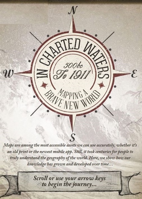
Use our interactive In Charted Waters tool which shows information & visuals on how our knowledge of the world map has evolved. Via Michael Miller, Mike Busarello's Digital Storybooks

Robert Slone's curator insight,
February 25, 2015 7:23 AM
This interactive map is phenomenal teaching tool that would be great for teaching elementary school children introductory geography, 
Samuel Meyer's curator insight,
March 23, 2015 12:00 PM
It is notable that the world's map has changed much since the advent of cartography, and many believed that the Americas were part of Asia. This is represented in the map.

Maps of countries, infrastructure projects, and invasions that never were — but might have been. Via Suvi Salo, Mike Busarello's Digital Storybooks

Mirta Liliana Filgueira's curator insight,
January 1, 2015 12:48 PM
20 mapas que nunca exiatieron en la práctica 
Claire Law's curator insight,
April 26, 2015 2:25 AM
Maps of places that would have been transformed by developments that never happened

Every so often, a hiker or a backpacker will run across something puzzling: a ginormous concrete arrow, as much as seventy feet in length, just sitting in the middle of scrub-covered America. What are these giant arrows? Jeopardy champ Ken Jennings solves the mystery.

"More Americans came into contact with maps during World War II than in any previous moment in American history. From the elaborate and innovative inserts in the National Geographic to the schematic and tactical pictures in newspapers, maps were everywhere. On September 1, 1939, the Nazis invaded Poland, and by the end of the day a map of Europe could not be bought anywhere in the United States. In fact, Rand McNally reported selling more maps and atlases of the European theaters in the first two weeks of September than in all the years since the armistice of 1918. Two years later, the attack on Pearl Harbor again sparked a demand for maps."

Nicole Kearsch's curator insight,
October 14, 2014 2:06 PM
Whenever there is war, Americans want maps. They want to know about where conflict is, how far away from home it is, and why people are being sent to the places they are being sent. With the new map ideas in World War II from Harrison maps were made to better display distance and direction to people. He used different projections in areas. He also drew maps from different places, for example what does Japan look like when you are in Siberia. Transforming flat maps back to having some sort of global shape was exactly what we needed to get away from the old outdated unreliable style of maps.
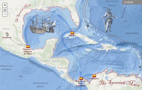
Explore the travels and exploits of five real pirates of the Caribbean. Click through the tabs to track the adventures of each pirate overlaid on Spanish ports and pirate strongholds in the area. Zoom into the map to see additional detail.

Jared Medeiros's curator insight,
February 11, 2015 10:00 PM
This pirate excursion map is so cool and gives a great look at the travels of different pirates. As we get farther away from these time periods, it seems like the idea of these Caribbean pirates are fictional. To hear true historical events about these individual pirates is very interesting. I would love to take a time machine back to Port Royal during these times to experience that madness. 
Brian Wilk's curator insight,
March 28, 2015 9:34 AM
Imagine the horror a native of the Caribbean must have felt when white men came into their scenic lands and pillaged their villages and plundered their treasuries? Blackbeard otherwise known as Edward Teach, would light slow burning cannon fuses and place them in his beard to create an aura about him as he fought and raided these port of call. Calico Jack Rackham, a great pirate name if there ever was one, was best known for having a pair of female pirates aboard. Instantly becomes one of my heroes! Then you have William Parker who was actually an opportunist backed by England who plundered Spanish treasures throughout Central America. Here is my favorite pirate joke; what is a pirate's favorite letter? "R" you say? No, it's the letter "C", pirates love the sea.... |


The World Economic Forum noted that some spatial research that was originally published in Nature, shows how geneticists took DNA samples from people of different cultures in different parts of the world to track their dispersal throughout the globe. The video uses climatic data, combined with the genetic data, to create a model showing how the human race spread across the globe over a 125,000 year period.
Tags: diffusion, demographics, mapping, migration, population, historical, video, visualization.