Rhode Island Geography Education Alliance
15.7K views | +4 today
Follow
Rhode Island Geography Education Alliance
News, resources and professional development for the Rhode Island Geography Education Alliance http://rigea.org
Curated by Seth Dixon
Your new post is loading...
Scooped by Seth Dixon
Scoop.it!

200 years of immigration to the U.S., visualized

200 years of immigration to the U.S., visualized | Rhode Island Geography Education Alliance | Scoop.it

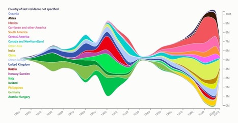
"Where have immigrants to the U.S. come from? Natalia Bronshtein, a professor and consultant who runs the blog Insightful Interaction, created this fascinating visualization of the number of immigrants to the U.S. since 1829 by country of origin.  The graph hints at tragic events in world history. The first influx of Irish occurred during the potato famine in 1845, while the massive influx of Russians in the first decade of the 20th Century was driven by anti-Semitic violence of the Russian pogroms (riots). Meanwhile in the Austro-Hungarian Empire, army conscription and the forced assimilation of minority groups drove people to the U.S. in the early 1900s.  Since WWII, Central and South America and Asia have replaced Europe as the largest source of immigrants to the U.S. Immigration shrunk to almost nothing as restrictions tightened during WWII, and then gradually expanded to reach its largest extent ever in the first decade of the 21st Century."


Tags: migration, historical, USAvisualization.

David Holoka's curator insight, September 8, 2015 9:36 AM

The statistics in this article shocked me. I already new America took in a large number of immigrants, but I thought most came illegally from Mexico. Instead, the immigrants we hold are very diverse in ethnicity.  

Mrs. Madeck's curator insight, October 1, 2015 5:56 PM

Migration

Fred Issa's curator insight, October 5, 2015 4:24 PM

We tend to forget that the first real Americans were the Native American Indians. Immigration is a hotly discussed topic right now, but I wonder where we would be as a nation, if the original Native Americans told the settlers at Roanoke Island, the Chesapeake, and Plymouth Rock, that no, we are not allowing any foreigners to settle on our shores and land. Food for thought. Fred Issa,

Scooped by Seth Dixon
Scoop.it!

Creating American Borders

30-second animation of the changes in U.S. historical county boundaries, 1629 - 2000. Historical state and territorial boundaries are also displayed from 178...
Seth Dixon's insight:

I love this time-lapse animation of all the county and state-level boundary changes in United States history.  Would you like to see this in greater detail?  Would you want to download the data and create your own visualization of this?  The Atlas of Historical County Boundaries has all of this data as GIS shapefiles, Google Earth KMZ files and PDFs for the whole country as well as for each individual state.  This project sponsored by The Newberry and the National Endowment for the Humanities has tremendous potential for use in the classroom for history and geography teachers alike.  


Tags: historical, USA, borders, time lapse, mapping, edtech.

Jesse Olsen's comment, March 16, 2013 1:04 PM
Whooooaaaaaaa!!!!
Betty Klug's curator insight, April 27, 2013 3:50 PM

I love animation maps.  Great for getting students interested in learning.

Samuel D'Amore's curator insight, December 14, 2014 6:36 PM

This video does a fantastic job of showing how the United States has expanded and grown since its original 13 colonies. While many today might imagine that our nation was simply always this size in fact over many years of colonization, land purchases and land grabs America has eventually become what it is today.