Your new post is loading...

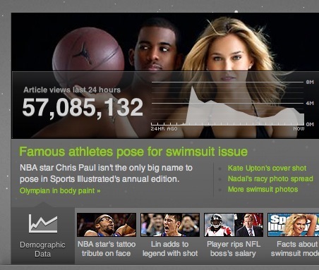

"The Yahoo!'s Content Optimization and Relevance Engine (C.O.R.E.) creates 13 million story combinations a day on Yahoo!'s home page. Check out this data visualization: http://visualize.yahoo.com and explore what readers in different age and demographics groups, or with different interests or locations are reading on Yahoo.
A great interactive visualization example that show how curating existing data and presenting it in an accessible and interactive way can create extra value.
Check it out: http://beta.visualize.yahoo.com/core/ "
What fascinates me about this is demographic breakdown of the media: who is consuming what types of media? It is clear that the media is being produced to fit particular demographics, but this is letting us 'peek behind the curtain' and see how social the media is becoming. How can educators 'customize' the information to fit their particular classroom demographic most effectively?
Via Robin Good