


Maps: Where would we be without them? This was banner year for beautiful, information-dense cartography, which provided a moment of self-reflection like a giant, geographic mirror.
Get Started for FREE
Sign up with Facebook Sign up with X
I don't have a Facebook or a X account


 Your new post is loading...
 Your new post is loading...
Your new post is loading...
Maps: Where would we be without them? This was banner year for beautiful, information-dense cartography, which provided a moment of self-reflection like a giant, geographic mirror.
Seth Dixon's insight:
Some of these are incredibly data rich and worth analyzing, and others are fluffy fun. 

Across cultures, people feel increased activity in different parts of the body as their mental state changes.
Seth Dixon's insight:
Mapping the mind/body/soul connections is beyond my expertise, but it is something everyone should seriously consider.

Jacqueline Taylor-Adams's curator insight,
December 31, 2013 12:38 PM
Emotions drive so much of our activities. Understanding how emotions manifest and impact our bodies are great lessons for us to learn on our journey to wellness. Walk with Me, #ImWalkingInWellness
Seth Dixon's insight:
Mapping layers are NEVER fully completed since the world that we live in is constantly changing.

"Zoomable autocomplete map of the world. Yahoo autocomplete results for countries and US states (screenshot of US states shown here)."
Seth Dixon's insight:
This is very interesting, showing what a search engine will automatically suggest. While this is telling on what opinions about places exist, you can't read too much into this because this reflects the numerous place-based stereotypes that are out there.

"The availability of Sweet Tea in Virginia as a Representation of the Mason-Dixon Line."

"Technically, they aren't crop circles, but that doesn't take away from the fact that they're beautiful. Simon Beck, a very talented artist from England, has unveiled his latest large-scale murals of geometric patterns in snow. Each one, which is created simply by walking through the snow and leaving behind track prints, adds a surreal element to its natural landscape. Beck walks countless miles on end to produce these mind-blowing symmetrical and elaborate designs on the soft, white bed of snow that covers acres upon acres of land."
Seth Dixon's insight:
Just because this is beautiful.

François Arnal's curator insight,
December 15, 2013 7:02 AM
Un peu de land art ou plutôt de "snow art". J'aime...

"Of the top 400 universities in the world, 128 of them are in North America and 181 in Europe. That’s an overwhelming dominance.
Seth Dixon's insight:
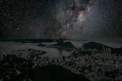
City lights are taken for granted as a normal part of the human landscape...it's fascinating to image a world without them.

The map above tracks the international migrations of a very specialized population—professional soccer players—since 1900. The tabs on the right let you isolate particular seasons or countries.

Katie's curator insight,
March 24, 2015 12:40 AM
This map shows the diffusion and migration of soccer from 1900 to 2013. I think this map is a very clear demonstration of the diffusion of soccer around the world. This is an example of diffusion patterns.

A rainbow network of broadcasts fills America's cities and frontiers.
Katie's curator insight,
March 24, 2015 12:44 AM
This map shows the different public radio stations around the US. I think this is a very clear map to show the spatial distributions of the radio stations. This would be an example of how to look at maps and see geospatial data. 
Logan Haller's curator insight,
May 25, 2015 9:39 PM
This article relates to unit 1 because it shows maps of different radio stations in the United States. There are four thematic maps to show the nations public radio stations.for example you can see that near the tip of Lake Michigan the news is WBEZ which is shown by a turquoise circle. The map shows that not all channels from good circles, this is because physical geography can disrupt signal. On the other hand like in Indiana there are not many peaks so they are tailored by the station to avoid interference with either other stations or just stations that share the same frequency.The maps show how our broadcasting system is patches of small non-profit stations nit together by organizations like NPR. The article says how the radio is a bunch of invisible waves emitted by antennae until they are stopped by some obstruction.
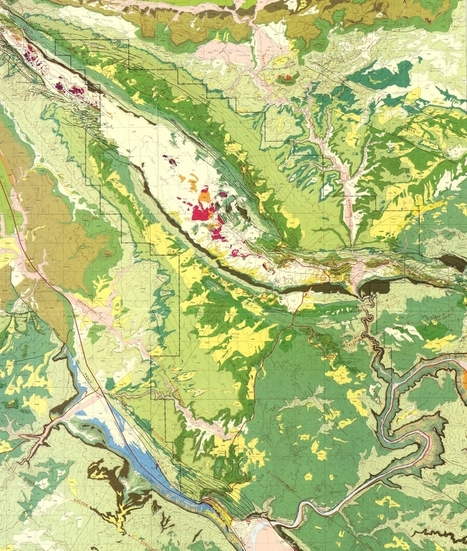
One of the reasons I became a geologist was the maps. Geologic maps are beautiful. I will never have enough walls in my house for all the geologic maps I'd love to hang. But these maps are also full of information about the surface of the Earth, with hints of what is below and what came before. There are colors for different ages of rocks, patterns for different kinds of rock, and lines for faults, elevation and boundaries between rock layers. One of the best things I ever got to do in school was make geologic maps. There are compasses, hand lenses, rock hammers, measuring staffs and colored pencils involved. You get to go out, find the rocks, determine what formation they belong to, which direction those formations extend and how steeply their layers are sloping. You get to draw all that information on the map, and then color it in. It's really fun and also challenging, and very satisfying. Some of the most memorable geologic maps I've seen have been of national parks. Maybe that's because the parks are one of the few places where you will easily be able to find, and buy, a geologic map of the place you are in at that moment. It also doesn't hurt that these maps reflect the landscapes they depict, and the landscapes are usually pretty amazing in the national parks. These are some of my favorite geologic maps of national parks.

Forget Google Maps! These are the maps everyone in San Francisco should really look at. This is a Yelp heat map with references to hispter.
|

"The map shows the percentage of viewers who tuned in to the Aug. 14 season four premiere of Duck Dynasty, the A&E reality series about a family from West Monroe, La., that makes duck calls for hunters."
Seth Dixon's insight:
I don't wan't to get into the recent controversy surrounding Duck Dynasty, but this map and a mental overlay of the electoral map go a long way to explaining many of the reactions to this controversy. Many TV executives are are firmly in the blue regions on this (and the political) map, while the TV show has great appeal within rural and Red America.

Worldwide tea is far more popular than coffee, but preferences for one beverage over the other fall into distinct geographic patterns.

Leoncio Lopez-Ocon's curator insight,
December 25, 2013 3:55 AM
Mapa que muestra el consumo del té y del café en el mundo
"Landsat has seen a lot in its day. In one spot of desert, where the Rio Grande marks the border between the United States and Mexico, the satellite program captured hundreds of images of fields turning green with the season, new developments expanding from El Paso, Texas, and clouds moving over the neighboring mountains."
Seth Dixon's insight:
Since I have family on both sides of this line, I've always be fascinated by the U.S.-Mexico border as a cultural, political and economic phenomenon. Ciudad Juárez/El Paso are examples of 'twin cities' that form along the border and in many ways are one metropolitan area that has been brought together by the interactions available at the border; at the same time this regions is highly divided by spatial governance policies. Click here to download high resolution images El Paso/Ciudad Juárez.

"All maps face the challenge of making the globe appear to scale in two dimensions. Most, like the traditional Mercator projection, keep either size or shape consistent — not both — which skews our perception of continents and countries one way or the other. But when you compare square mileage, a whole new world appears. Inspired by this map of Africa's true size from German graphic designer Kai Krause, we created 11 map overlays to open your eyes to some real geography."

Siri Anderson's curator insight,
January 22, 2014 8:28 AM
Thanks to Seth Dixon for curating awesome Geography tools for all.
Seth Dixon's insight:
Anybody want to give me a Christmas present? This would be beyond awesome.

Mary Patrick Schoettinger's comment,
December 10, 2013 11:57 AM
Will the desk size model do? This is beautiful!

What could be the worst tidal surge in six decades has swamped parts of the U.K. but not London, thanks to the miraculous Barrier.

Phone-call data track the distribution of courtesy (and the lack of it) over recorded conversations. We'd thought better of you, Buckeyes.
Seth Dixon's insight:
Would you wear your civic pride in a way that shows off your love of maps? You know you want to!

"Some of the volcanic bluestones in the inner ring of Stonehenge officially match an outcrop in Wales that's 160 miles (257 kilometers) from the world-famous site, geologists announced this week. (See Wales pictures.) The discovery leaves two big ideas standing about how the massive pieces of the monument arrived at Salisbury Plain: entirely by human hand, or partly by glacier. As it looks today, 5,000-year-old Stonehenge has an outer ring of 20- to 30-ton sandstone blocks and an inner ring and horseshoe of 3- to 5-ton volcanic bluestone blocks. (See Stonehenge pictures.)"
"Japanese artist Isao Hashimoto has created a beautiful, undeniably scary time-lapse map of the 2053 nuclear explosions which have taken place between 1945 and 1998, beginning with the Manhattan Project's "Trinity" test near Los Alamos and concluding with Pakistan's nuclear tests in May of 1998. This leaves out North Korea's two alleged nuclear tests in this past decade (the legitimacy of both of which is not 100% clear).

“Very fun interactive here: http://www.jasondavies.com/maps/transition/ (Click ‘pause’ though or you’ll start to get dizzy after a while.)" Via Mr. David Burton
|


Awesome options for your collection.