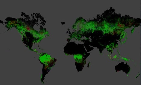

Brazil has managed to cut deforestation in half since 2000. But that's been offset by increasing forest loss in other countries.
Get Started for FREE
Sign up with Facebook Sign up with X
I don't have a Facebook or a X account


 Your new post is loading...
 Your new post is loading...
Your new post is loading...
Brazil has managed to cut deforestation in half since 2000. But that's been offset by increasing forest loss in other countries. 
No comment yet.
Sign up to comment

Who would have thought that the marriage of two tiny little words - pine from the Latin 'pīnus' meaning "sap, juice" and apple from 'apple' meaning "apple" would have split the UK from the rest of the world way back when it was first recorded in 1398?

Create a color-coded Visited States Map, showing off your road travel in the United States.

... And simplify American time zones in the process
Seth Dixon's insight:
I personally want 26 hour days that are non-sonal synchronous, but I"m not holding my breath.

West Virginia is the most neurotic state, Utah is the most agreeable and the folks of Wisconsin are the country's most extroverted, a new study says.
Seth Dixon's insight:
Even before looking at the map or the questions I thought, "it's going to say I belong in Utah." I did live there for about 8 years and what did I get as my answer: Utah. Which state are you? Agree or disagree?

Click through for a larger version. (Reuben Fischer-Baum)My friend Judy used to always say that whenever she met another Judy, she knew exactly how old that Judy was—to the day.

A while back, I posted in the forums asking for people to help me find a YA book for every single state in the US.

Tiffany Emerick's curator insight,
December 8, 2013 3:30 PM
What a great idea! I think I have only read 17/50. Maybe a 2014 reading goal.
Seth Dixon's insight:
This map draws the longest straight line on the sea without hitting land...more importantly it serves as a reminder of the distortion inherent in all maps.
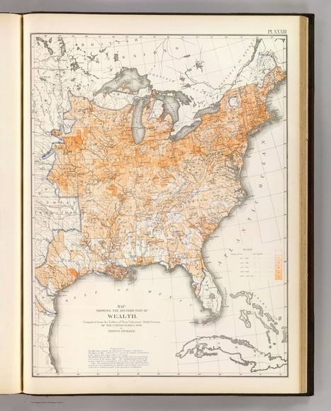
This map, made with data from the 1870 census, shows rates of wealth per capita in the settled United States.
|
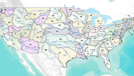
Instead of fighting over water what if each state's boundaries let it get water from one source? Check out the Watershed States of America.
Seth Dixon's insight:
This is an intriguing map; it doesn't strictly follow watersheds, but combines our local 50 states and the major watersheds.

Meet the data treasure trove known as "NOAA View." Weather geeks, say goodbye to your morning productivity. The data conjurers at NOAA have rolled their latest environmental visualization out of the hanger, and it is bursting with every possible thing you'd want to know about the planet's health, from past to present to worrisome future. Want to know what the clouds like looked during your city's last nasty storm? The "NOAA View" portal has crisp satellite images stretching 5 years back. Curious where snow and ice have accumulated this year? The frozen stuff is splashed about the globe like splattered white frosting.

This simulation gives an eerily omniscient vantage on the world as it fills.

The U.S. has 4 percent of the world's population and 34 percent of its Nobel laureates
Seth Dixon's insight:
This really is a stunning visual display of the uneven distribution of so many things.

Every state has a book that it is best known for. Here are the most famous books that take place in every state.
Seth Dixon's insight:
Click here to read more about each of these titles.

Just about anybody can make a map and slap it up on the internet these days, and that’s a mixed blessing for professional cartographers. On the upside, they’re mostly happy to see more people taking an interest and getting engaged in mapmaking. On the other hand, some of the maps made by amateurs are cringe-inducing mockeries of good cartographic design. And to make things worse — some of them go viral. But instead of just making snarky comments about these amateur maps to their colleagues on Twitter, cartographers might want to consider the qualities that make maps like this go viral, according to information designer and cartographer Marty Elmer, who runs the popular blog Map Hugger.

Facebook, Google, and—a newspaper? Two researchers, Mark Graham and Stefano De Stabbata, at the Oxford Internet Institute have depicted the world’s “Internet empires” in a map, below. The map shows each nation’s most popular website, with the size of nations altered to reflect the number of Internet users there.
Seth Dixon's insight:
This video is part of an article showing the method behind the madness in this cartographic work of art. Great maps start out with a vision, and a passion to make that vision come to fruition.

For decades, Lady Liberty, mother of exiles, stood watch as millions of immigrants arrived in the U.S. in hope of a better life.

Blake Welborn's curator insight,
May 20, 2014 12:22 PM
As culture evolves in the US, it lends a lot to culture of past. This map shows us ancestry of the population, and by doing this we can see and infer what type of culture is there based on what the brought over while migrating. |